Work
Team of creators who work together to build a better, more inclusive digital world. Our team uses an agile approach and a flexible attitude to maximize client satisfaction and success.
-
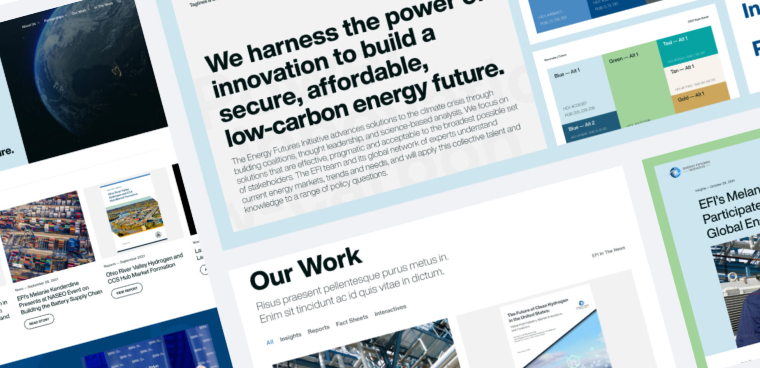
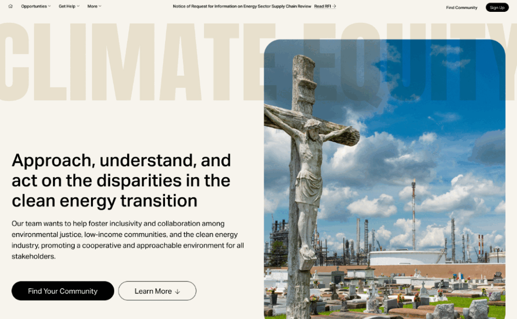
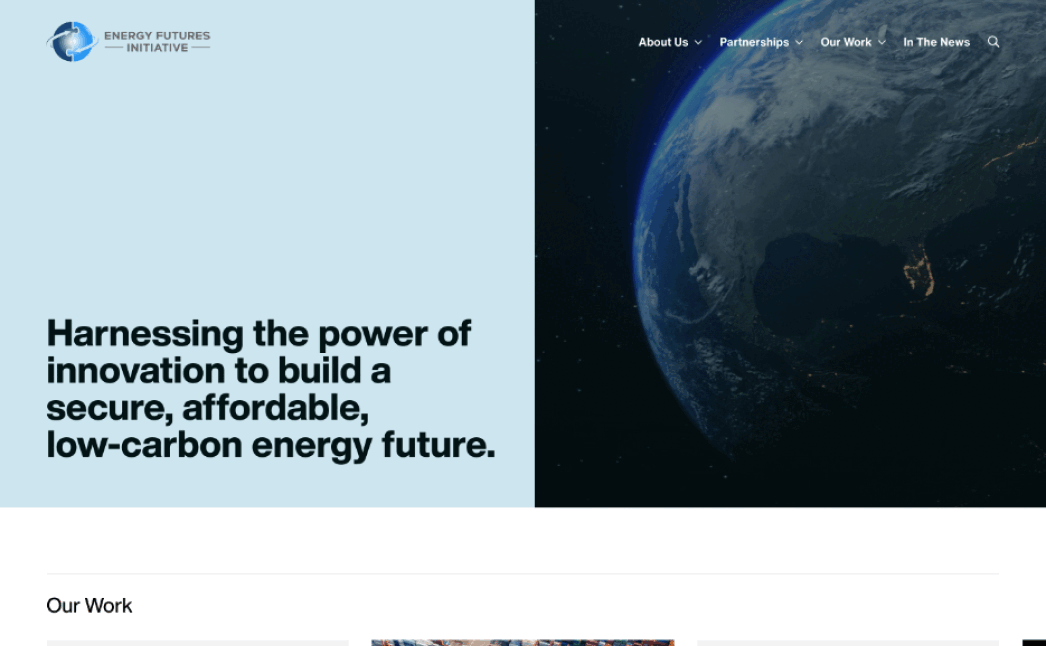
Energy Futures Initiative
Design + Development + StrategyA central hub for the rigorous, science-based analysis work authored by EFI that identifies the fastest pathways to a low-carbon energy transition
-
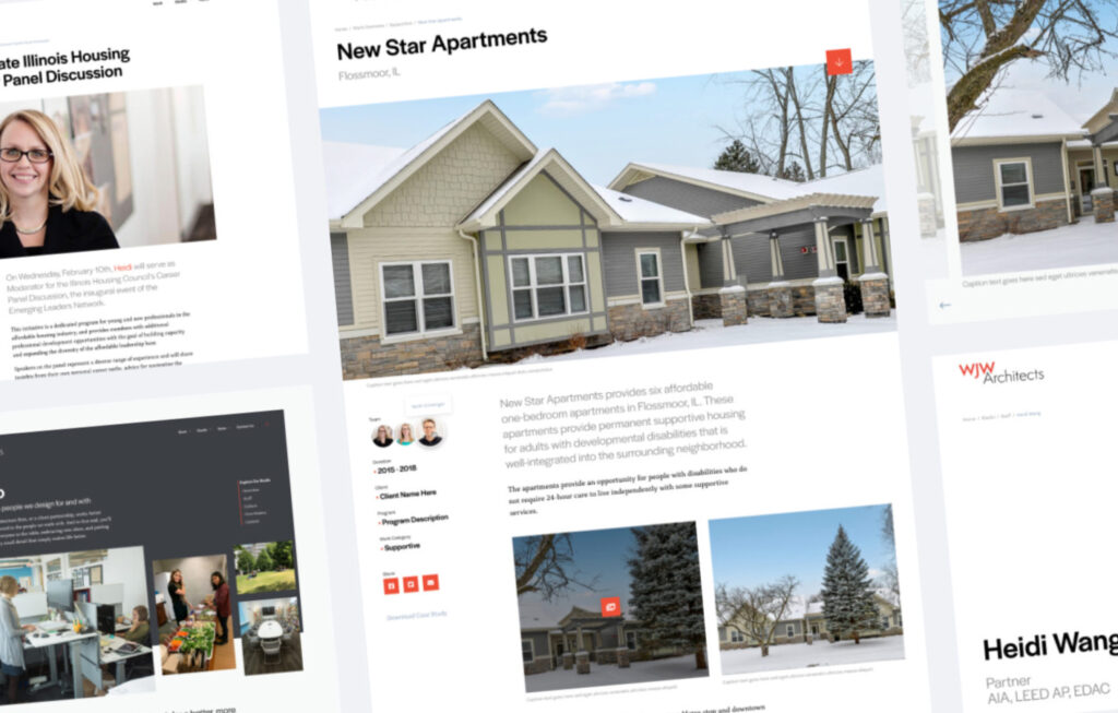
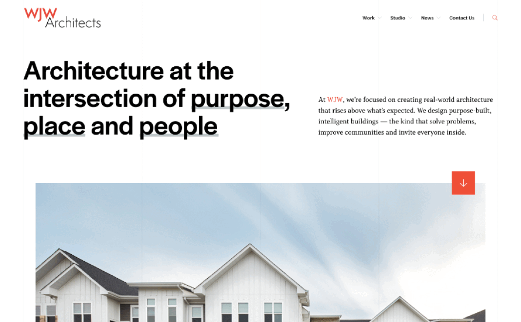
WJW Architects
Design + Development + StrategyCreating real-world architecture that rises above what’s expected
-
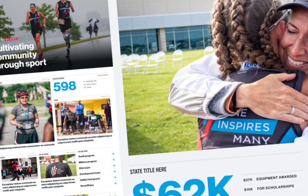
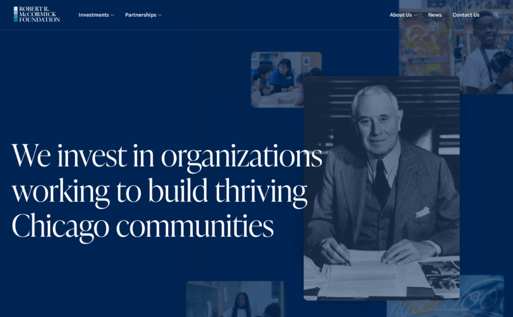
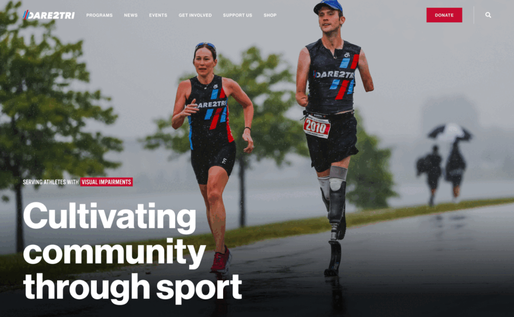
Dare2tri
Design + Development + StrategyAn inclusive digital destination that promotes and highlights how sports cultivate community engagement
2011 — 2024
Project List
-
2024
Center for News, Technology & Innovation
Design + Development
-
2024
The Foley Foundation
Design + Development
-
2024
Current
Design + Development
-
-
2023
The Business Journals – Event Hubs
Design + Strategy
-
-
-
-
-
-
-
-
-
-
-
-
-
2020
Lucida / Climate Advisers Trust
Design + Development + Strategy
-
2020
Northwestern | Medill
Design + Development + Strategy
-
-
2020
U.S. Energy & Employment Report
Design + Development
-
2020
National Governors Association
Design + Development
-
2019
Al-Monitor
Design + Strategy
-
2019
Mecum Auto Auctions
Design + Strategy
-
-
-
-
-
-
2017
Bloc
Design + Development
-
-
-
-
-
-
-
-
2015
DePaul University | Digital Youth Network
Design + Development + Strategy
-
2015
Red Ventures
Design + Development + Strategy
-