As a front-end designer at a service-oriented development firm, it can be hard to maintain a design-to-code workflow that is both efficient and practical. While there are more tools and plugins than ever at our disposal, there are also more tools and plugins than ever.
At Made by Munsters, our design team is proficient in both standard web design tools as well as front-end development — HTML, CSS (Sass), and basic JavaScript. They are responsible for turning their component-first, modular web application designs into actual code.
But similar to other designers in our position, our team struggles with maintainability and consistency. The workflow of turning static designs into responsive web components is tough. Type sizes are forced to change based on content overflow issues, viewport sizes cause well-defined design components to break, and spacing is never correct (no matter how hard we try). This puts our designers in a precarious position. To what extent should their design elements match the product’s front-end components? Moreover, how much time should be invested into creating pixel-perfect parity?
Tools such as Sketch have helped us to think component-first and think more globally about design elements and layering or nesting to create DRY design files. Plugins such as HTML-sketchapp and react-sketchapp have helped to turn our design files into living, breathing design systems that update when our code changes. But if you are on a deadline and will likely be handing this project off, is setting up these tools the most efficient use of time?
At Made by Munsters, we have come to the conclusion that static design files are only the starting point. They are just an asset we use to create a visual reference of our user experiences. Thus, they do not need to match a developed view to the T. They merely need to get us started.
So then what does the transition from Sketch component to HTML/Sass component look like for us? Great question.
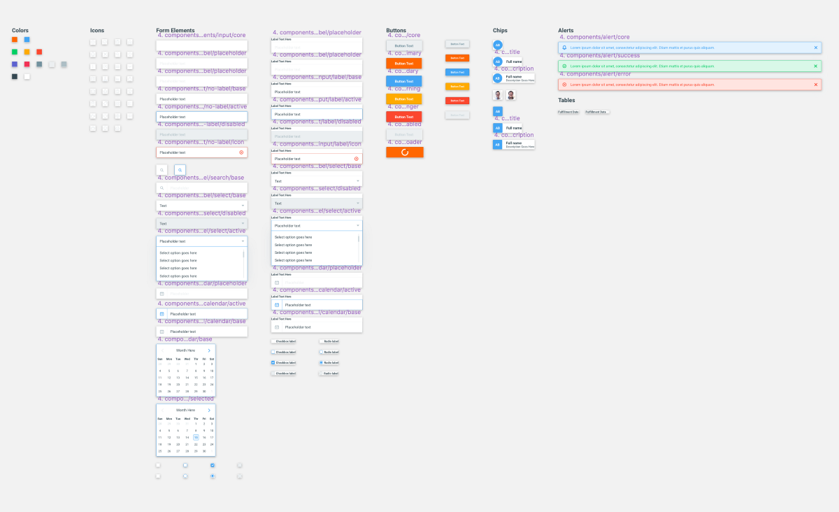
First, we start by creating a highly extensible Sketch symbol. This starts by adding our basic brand standard elements such as colors or type and nesting those symbols into another button symbol. Yes, we create symbols for our type and color styles. You don’t?
Note: The image above shows each button type as a different component. Another option would be to insert a color symbol as the background. This way you have one button and can change the color as a symbol setting.
By adding these basics we have full control over every aspect of a component. Additionally, if we determine we need to make a change to a type size, line height or font family we can update multiple components with a single click.
Once our basic brand styles have been created and applied, we will turn those into working pieces of code. This helps to ensure that the properties we have defined, work well in a browser.
Note: Since we are Sass-based development firm, the code samples used throughout this post will be in that language.
In our color variable file we will create our variables and a simple list.
// Colors Variables
// ========================================

// Black
$black-base: #344750;

// Blue
$blue-base: #42A5F5;

// Green
$green-base: #00CF63;

// Grey
$grey-base: #ECEFF1;

// Orange
$orange-base: #FF6600;

// Pink
$pink-base: #F23154;

// Purple
$purple-base: #5D62CF;

// Yellow
$yellow-base: #FFAA00;

// Red
$red-base: #FC472E;

// White
$white-base: #FFFFFF;

// Main Palette List
$colors: (
 black-base: $black-base,
 blue-base: $blue-base,
 green-base: $green-base,
 grey-base: $grey-base,
 orange-base: $orange-base,
 pink-base: $pink-base,
 purple-base: $purple-base,
 yellow-base: $yellow-base,
 red-base: $red-base,
 white-base: $white-base
);
We do the same for our font properties.
// Typography Variables
// ===============================================

// Font Families
$primary-sans-serif: ‘Roboto’, sans-serif;;

// Sizes
$font-size-base: 15px;
$s-alpha: 42px;
$s-bravo: 36px;
$s-charlie: 24px;
$s-delta: 18px;
$s-echo: 16px;
$s-foxtrot: $font-size-base;
$s-golf: 12px;
$s-hotel: 10px;

// Line Heights
$base-line-height: 1.0;
$base-line-small: $font-size-base;
Great, now we can test these styles out and make sure they look and feel right in the browser.
Next, we create a mixin for our button component.
// Button Mixin Setting Stylesheet
// ========================================

// Button Standard
@mixin button($background-value, $border-color-value, $color-value) {

  // Variables
  $button-box-shadow-remove:          0 0 0 transparent;
  $button-border:                     1px solid;
  $button-display:                    inline-block;
  $button-line-height:                normal;
  $button-padding:                    $spacer-delta $spacer-charlie;
  $button-radius:                     2px;
  $button-text-align:                 center;
  $button-text-transform:             capitalize;
  $button-transition:                 background-color 0.3s ease;
  $button-hover-cursor:               pointer;
  $button-hover-opacity:              1;
  $button-focus-border:               inherit;
  $button-focus-outline:              none;
  $button-focus-text-decoration:      none;

  // Properties
  background-color: $background-value;
  border: $button-border;
  border-color: $border-color-value;
  border-radius: $button-radius;
  color: $color-value;
  display: $button-display;
  font-family: $primary-sans-serif;
  font-size: $s-foxtrot;
  height: auto;
  line-height: $button-line-height;
  padding: $button-padding;
  text-align: $button-text-align;
  text-decoration: none;
  text-transform: $button-text-transform;
  transition: $button-transition;
  -webkit-appearance: none;

  &:hover {
    background-color: darken($background-value, 5%);
    cursor: $button-hover-cursor;
    opacity: $button-hover-opacity;
  }

  &:focus {
    border: $button-focus-border;
    outline: $button-focus-outline;
    text-decoration: $button-focus-text-decoration;
  }

  &:active {
    opacity: 1;
  }

  &:focus,
  &:active {
    box-shadow: $button-box-shadow-remove;
    border: 1px solid $border-color-value;
  }
}
What’s going on in this component? Well since we know that we will have several button types based on our Sketch file, we create a mixin that contains the core structure of the button and takes three dynamic properties — background color, border color and text color.
Next, we create map that defines are button types.
// Buttons Variables
// ========================================

// Buttons Standard
$buttons: (
  // Button Class Name
  'primary': (
    background-color: $orange-base, // Background Color
    border-color: darken($orange-base, 15%), // Border Color
    color: $white-base // Color
  ),
  'secondary': (
    background-color: $blue-base,
    border-color: darken($blue-base, 15%),
    color: $white-base
  ),
  'danger': (
    background-color: $red-base,
    border-color: darken($red-base, 20%),
    color: $white-base
  ),
  'default': (
    background-color: $grey-base,
    border-color: $grey-alt-2,
    color: $grey-alt
  ),
  'disabled': (
    background-color: $grey-base,
    border-color: $grey-base,
    color: $grey-alt-2
  )
);
In the code above, you can see that we are simply adding dynamic styles for our button types.
Finally, we create a loop to iterate over our button types and generate pretty, Sketch-like buttons.
// Button Component Styles
// ========================================

// Variables
$button-hover-cursor-disabled:      not-allowed;

// Structure
@each $button, $styles in $buttons {
  $bg-color:      map-get($styles, background-color);
  $border-color:  map-get($styles, border-color);
  $color:         map-get($styles, color);  // Buttons
  .button--#{$button} {
    @include button($bg-color, $border-color, $color);  // Disabled Button Hover
    &:hover {    @if $button == 'disabled' {
        background-color: $bg-color;
        border: 1px solid $bg-color;
        cursor: $button-hover-cursor-disabled;
      }
    }
  }
}
This loop will find our buttons map and insert the dynamic values for each button in our button mixin as arguments.
From here, if we need to make changes to the developed component, we do so without editing the Sketch file. If we need to tweak the font-size or border-color we will make those updates in the browser.
The only time we will update our Sketch library is if our component has been significantly changed. Otherwise, we find the back-and-forth and consistent tweaking leads to dead time and inefficient workflows.
Tools such as Sketch are great. They help us as designers rapidly produce quality work, but at the end of the day, they are only static designs. The designs we create with them should be used to collect initial data on a flow or visual concept and not viewed as the holy grail.