A couple of years back, our stellar team went on a mission to cook up some killer layout blocks for WordPress’ Gutenberg editor. Our grand plan? Introduce a slick 12-column, responsive grid system that not only made implementing our designs a breeze but also empowered our clients to expand their sites solo once we hit the launch button.
After a few weeks of tinkering and testing, we birthed the first version of Gridible. The results? Time spent implementing our Figma designs plummeted, and our clients couldn’t stop singing praises about how effortlessly they could whip up responsive pages. No more one-off custom blocks or stylesheets. Plus, it was a farewell to heavy reliance on plugins like Advanced Custom Fields and Elementor. We ditched the plugins and embraced the magic of the core WordPress blocks, sprinkled with our layout blocks, to craft responsive patterns and templates for our clients.
Guess what? We’re thrilled to spill the beans that in just a few weeks, we’re rolling out a spanking new, public version of Gridible that snugly aligns with WordPress’ roadmap for the future.
What’s the scoop, you ask? Brace yourself – it’s a game-changer.
First off, we’ve jazzed up the container block to play nice with your theme’s layout constraints. Now you can strut your stuff with a max-container width of your choosing. No more battling with CSS classes to tweak that max-width – we’ve got you covered.
Second, we’ve cut the cords tying spacing increments to the rule of eight. While we dig the rule of eight in our themes, we get that not everyone’s vibing with it. So, wherever spacing pops up – be it padding, margin, or block gaps – we’re tapping into your theme’s default spacing rules from the theme.json file. Update your spacing rules, and watch the blocks effortlessly catch on. And fear not, you can still throw in custom spacing sizes when the mood strikes.
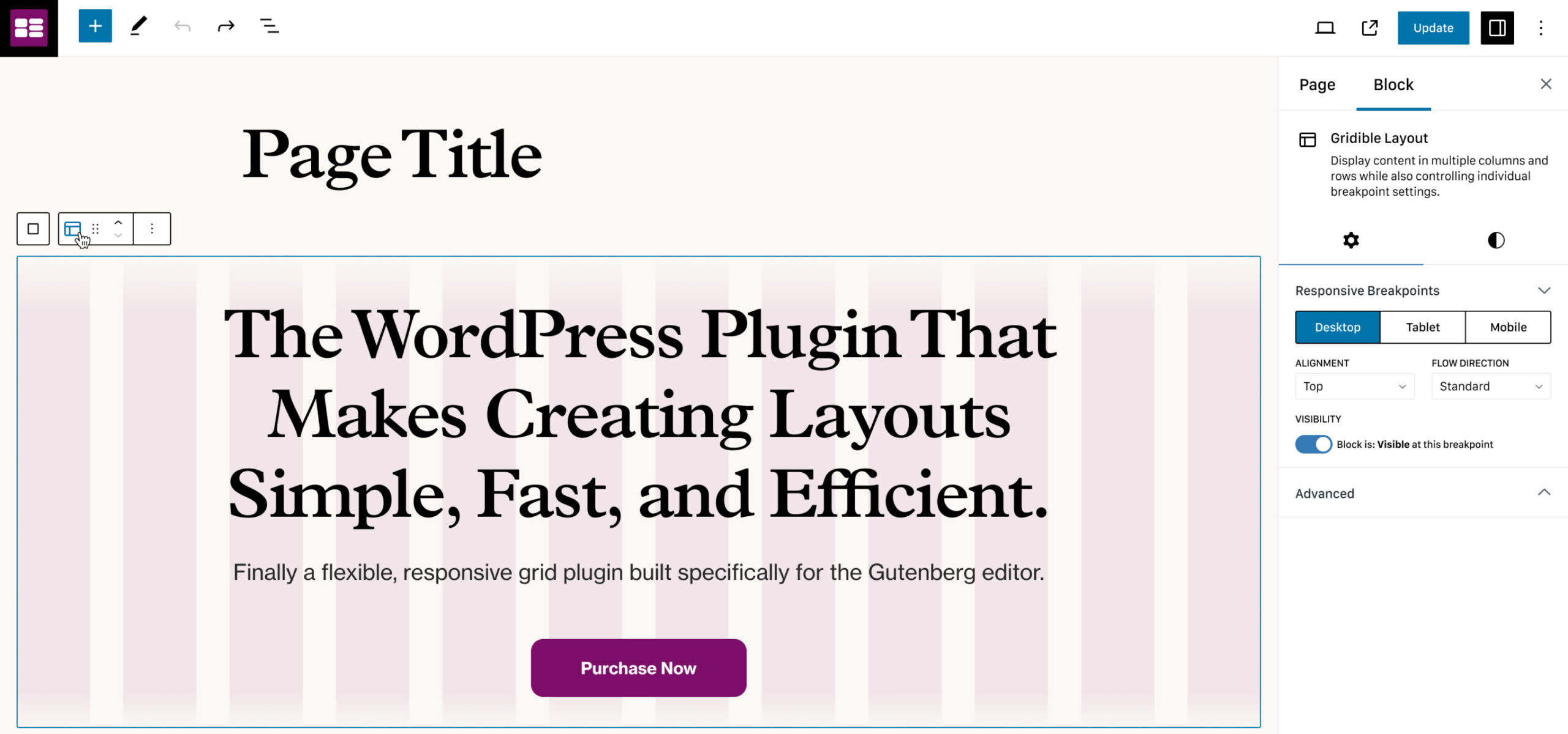
Next on the hit list: bid farewell to our custom breakpoint sizes. We’re riding the wave of the core blocks’ breakpoint sizes now, ensuring those layout shifts stay on point. This tweak also lets us dive into the device preview controls in the admin panel, making your editing experience sleeker than ever.
Last but not least, we’ve given our visibility settings a makeover. Now, with core WordPress breakpoints in the mix, you can toggle visibility per breakpoint. Switch up your device preview, and watch the block do its magic – show or hide in perfect harmony with the front-end output. Editing, meet mirroring.
And hey, these are just a few gems from the treasure trove of changes we’ve made. Under the hood, we’ve fine-tuned performance and durability like never before. We’re not stopping here – more tweaks, and more improvements, coming your way in the weeks ahead.
If you’re itching to get your hands on Gridible 2.0 and be part of our tester squad, shoot us a message. We’re always on the lookout for fearless pioneers!