There are a lot of ways to kick off a new project. You might host a discovery workshop that allows your team and your client or stakeholders a chance to discuss the product’s current problems and what solutions could be implemented to solve those problems.
Or if a big kickoff meeting is not possible, you might do some research on your own to learn more about the product, the business vertical(s) it falls in, and what others in the industry are doing to solve the same or similar challenges. Or maybe you just go for it. You start to sketch and design full pixel layouts the day the contract is signed.
Odds are, if you’re like us, you will do a combination of the above. At Made by Munsters, we enjoy having a kickoff meeting to learn more about the product and the people behind that product. Followed by a week or so of user research and industry understanding. This helps us answer the five Ws (and one H). This process can be slow at times, and if you know anything about us, that’s not our style. But worth it as we try to better familiarize ourselves with our client’s work and their industry.
We enjoy working in short sprints – design and development. It helps keeps us focused and allows us to push the project further down the timeline. This means our clients have to be fully engaged and willing to make decisions quickly. This is why we recently moved away from diving into designs without a clear design direction selected first. To avoid several rounds of design revisions, we now start with style tiles.
What Is A Style Tile?
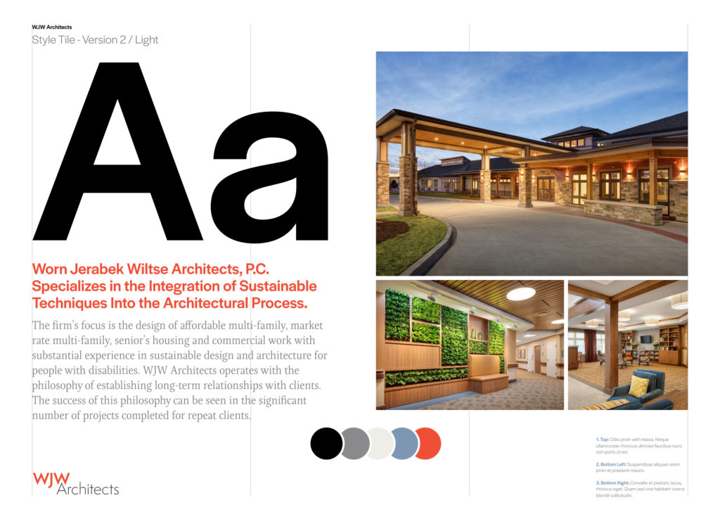
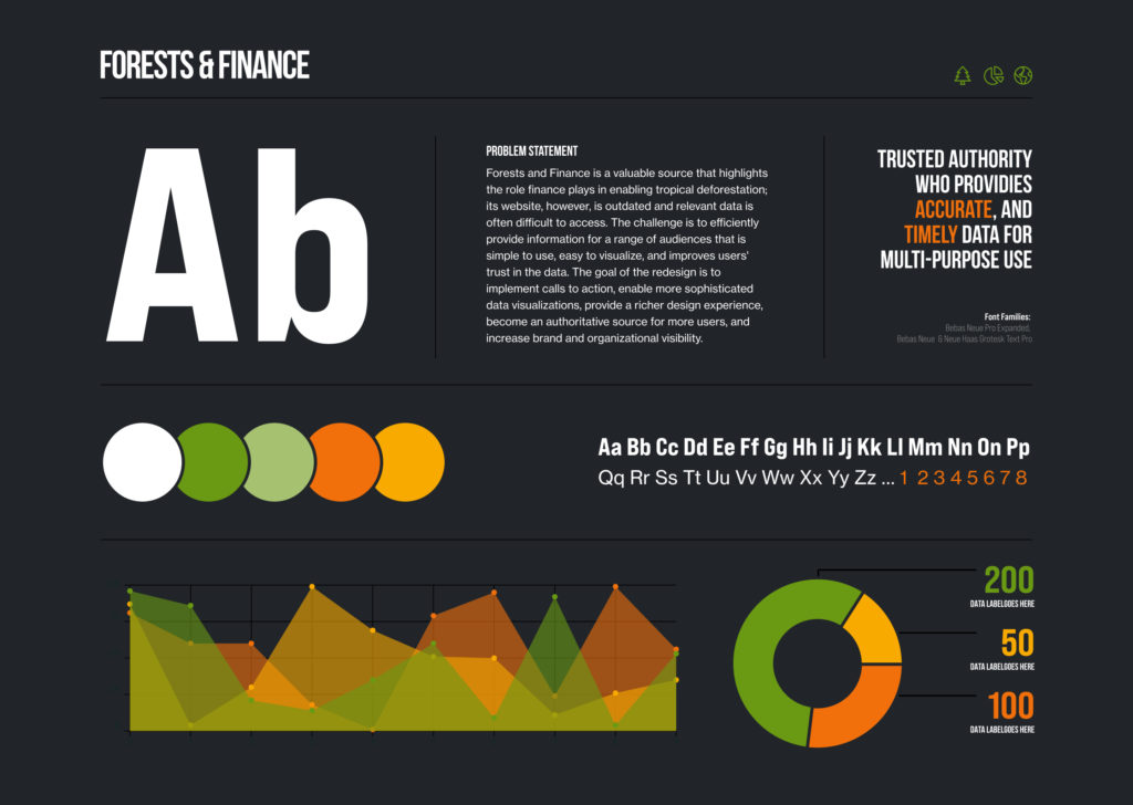
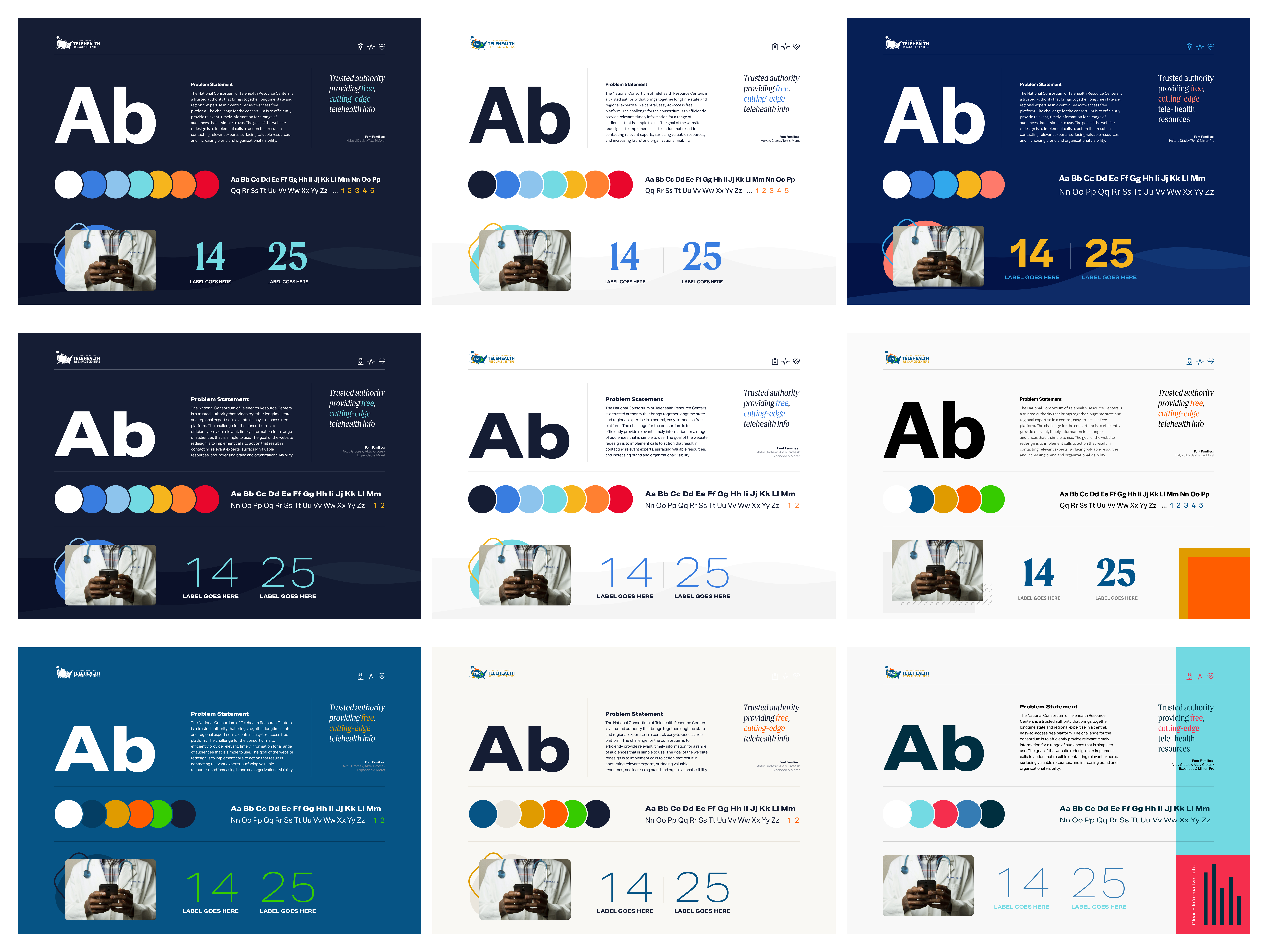
That’s a great question. It’s a simple artboard that outlines the core assets in your design. This typically includes colors, type and type weights, image styles, and any other core design elements.
Here are a few examples:


As you can see from the two examples above, style tiles illustrate what the website will look like at a high level. It’s not meant to provide the client with detailed components or elements that make up pages. Nor is it meant to provide your stakeholders with a structural layout of the website. It merely introduces them to the core design assets you intend to use.
Why Create Style Tiles?
For us, it’s all about time. The amount of time it takes to complete a fully flushed-out style tile versus the amount of time it takes to layout a full-page design is quite different. During the early phases of our work, we want our clients to make decisive decisions. This allows us to unblock other tasks and keep our flow moving forward.
Moreover, we have found that the style tiles get our clients thinking about their website’s overall look and feel faster than introducing them to new content sections or modules. If a client is reviewing a design and stumbles upon a module they don’t like, that might be it for the overall look and feel of that style. On the other hand, if they have already agreed to a certain style, it might only be a matter of tweaking the content module in order to get approval.
Just to reiterate, style tiles allow us to move rapidly, produce decisive decisions early on in the project, and keep us focused on a single goal vs many.
How Do We Create Style Tiles?
There are no right or wrong ways to create a style tile. In fact, we find that each project is a bit different. Some projects require us to show more illustration styles. While other projects focus on typography and how we might use different font families together.
We don’t have a template or file that we use each time because that won’t work for every project. We suggest starting with the basics – type, color, images, etc. – and then adding any additional items you think the client needs to see in order to make a well-informed decision.
But remember, the name of the game is speed. You want to be as efficient as you can during this phase of the work knowing that you might have to create dozens of style tiles in order to find the right combination that works.
Final Thoughts
Style tiles are a quick and efficient way for us to demonstrate what our client’s new website will look and feel like without having to waste time on full-scale layouts. There are no right or wrong ways of creating a style tile. It’s about finding the right balance between showing just enough and showing too much.
Always keep in mind, at this stage, you’re looking for feedback and approval on the core design elements, not the way those design elements will be used to create beautiful layouts.

