Get Gridible
We turned our in-house grid system into a WordPress plugin. Say hello to the WordPress plugin that makes creating layouts simple, fast, and efficient for you and your clients. Download the beta at Gridible.com.
Update: We are making some big changes to Gridible. Read about the updates in our new post.
—
Over the last few years, we have been building a lot of websites on WordPress. At first, we were a bit hesitant. Our first experiences with WordPress back in the day were not great. As designers, we found it hard to create complex layouts efficiently. Moreover, our clients were oftentimes confused about how to edit their content once we handed off our projects.
Thus, we did what all great digital studios do, found a different solution, and abandoned WordPress altogether. I’m sort of joking here. Most studios would have spent more time understanding the framework in order to produce higher-quality work.
Anyways, we had the opportunity to jump back into WordPress about two years ago. And as I said, we were a bit hesitant. Until we read up on Gutenberg. It’s a whole new way to layout pages within WordPress and allows clients to make content edits in a clean, WYSIWYG-like experience.
But there was one problem. We use a grid-based layout approach where we assign columns to span specific widths and the content contained within that column stretches to its parent’s bounding box. When asked to build this specific client site on WordPress, this wasn’t and still isn’t a native feature of Gutenberg. Instead of running away this time, we set out to solve the problem by creating a set of Gutenberg blocks.
First, because we use a mix of full-width modules and modules that should be contained within a container, we needed to create a container block.
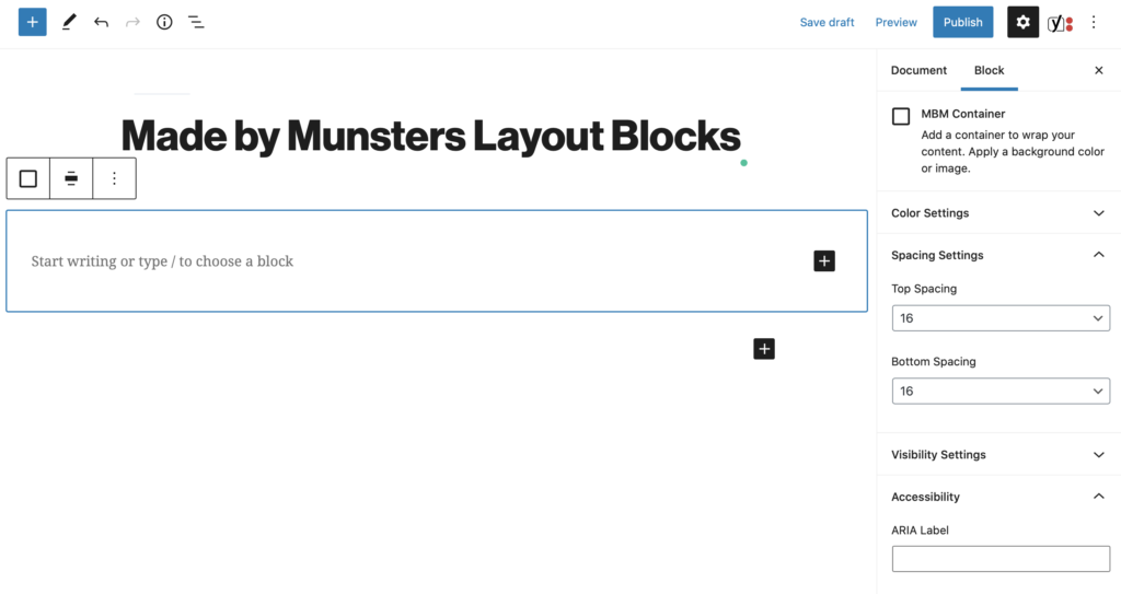
This container block needed to do a few things:
- Automatically set a max-width for the content.
- Increase or decrease the container’s padding.
- Allow admins to set a background color for the container.
- Allow the container block to consume any blocks, whether native or custom.
- Allow admins to set the container’s element type. (I.E. Section, Article, Div, Etc.)
- Allow admins to add an accessibility label for the group.
While it’s a relatively simple block, it was important that we create a container block that allowed us to continue to design and develop in the way we were accustomed to.
Once the container block worked as we had hoped we moved on to the next obstacle, creating a flexible grid system that didn’t require too much thinking from the user or client. Ultimately this wasn’t a tool for our team, it was a tool for our clients. They needed to be able to create complex layouts once our initial work with them was done.
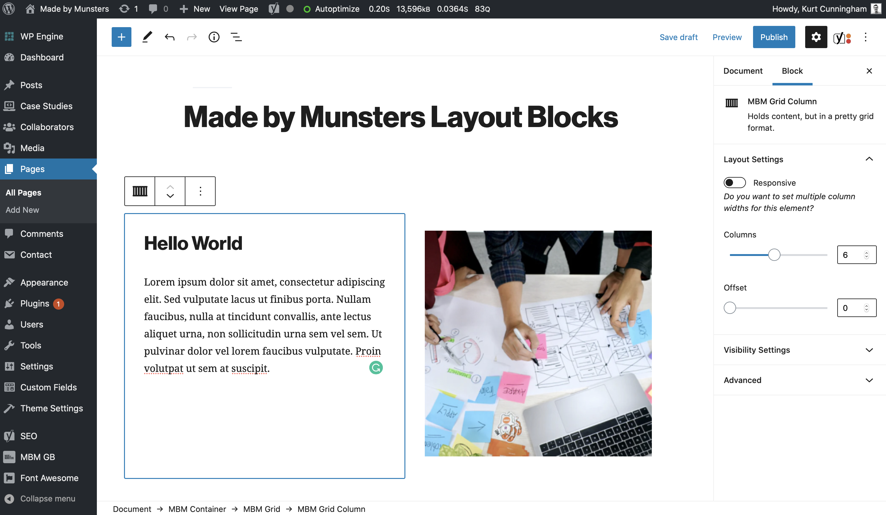
The grid block we created, for the most part, accomplishes this goal. The grid block is a standalone block and does not need to be placed inside the container block. It simply creates a set of responsive rows and columns that can contain any content.
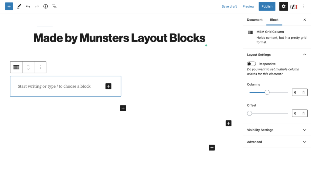
In a nutshell, the grid block creates a row that wraps a set of columns. Admins can set the alignment per-viewport size or they can choose to set a universal alignment.
Additionally, the grid block allows admins to add a series of columns (pictured above). These columns are adjustable and line up horizontally until the combined size of the columns exceeds 12. At that point, the rightmost column block wraps around to the next line, starting the process all over again.
Similar to the alignment feature of the grid block, the column blocks can be adjusted per viewport size or have a universal size set for all viewports. Columns can also take an offset-per-viewport or universal. This way admins can push content away from other columns or from the container walls. Lastly, admins can set the visibility of columns based on the viewport size. This way they can hide and show content on different devices and or rearrange content as needed.
We found that these two blocks alone have saved us time and energy. They allow us to create flexible, responsive, and most importantly, native WordPress layouts without any hacks or workarounds.
But it hasn’t been all rainbows and sunshine. I will admit, I was somewhat wrong in thinking all of our clients could create flexible layouts with just these two blocks. We have found it’s hard teaching non-designers the concept of a grid layout in less than 30 minutes on an Uber Conference. It’s also hard trying to teach busy individuals the idea of visual layouts, spacing, and alignment.
Thus, we are working on updates to our layout blocks to introduce common patterns. These patterns will piggyback off of the container and grid blocks but be simplified to help our clients more effectively build page layouts.
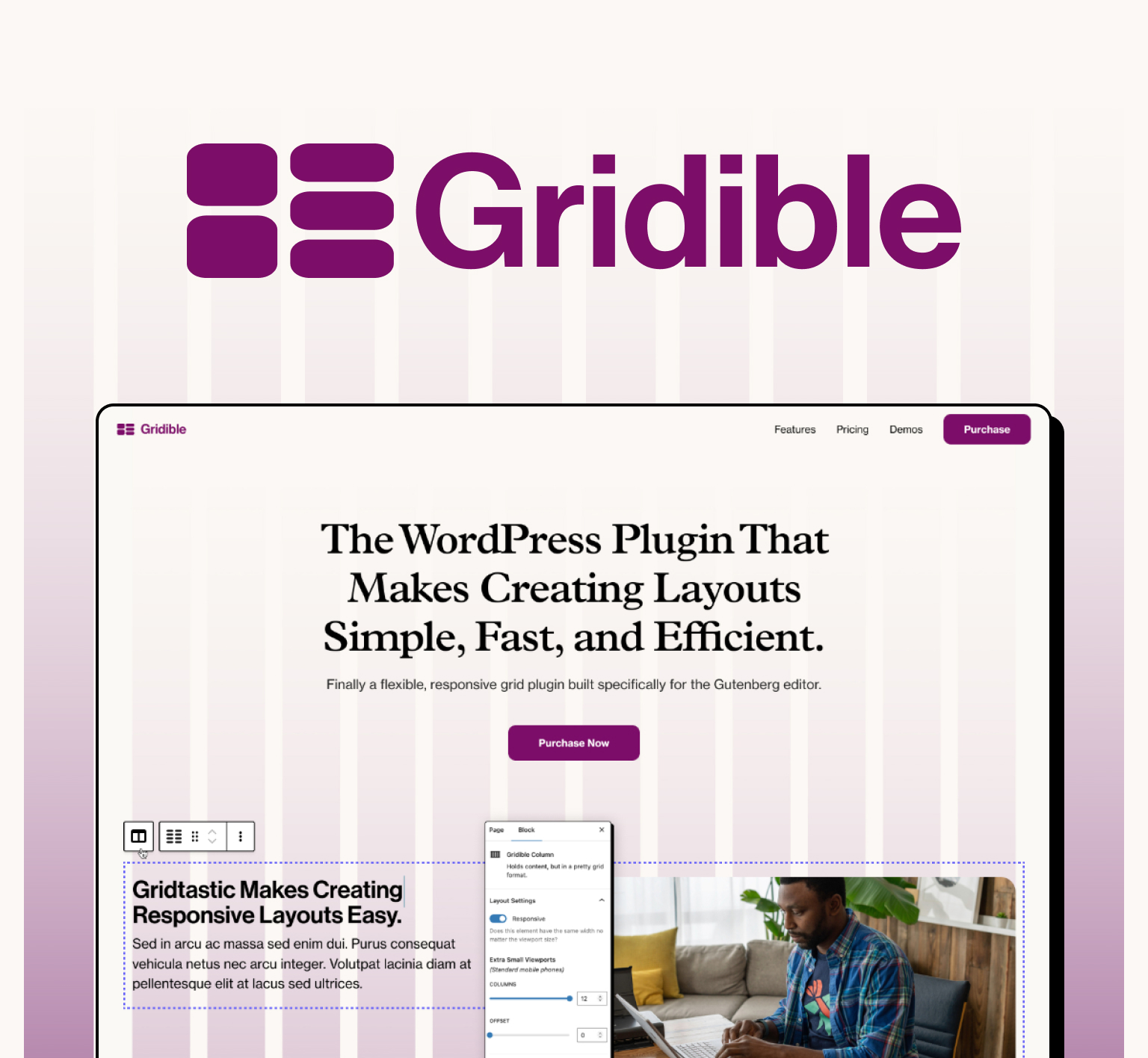
Check out our plugin Gridible that will help you create create, responsive WordPress layouts.